Knowledge base » Release Notes - EpiSoft/CareZone » 05/04/2016 - Release Notes RANZCO Users
05/04/2016 - Release Notes RANZCO Users
Changes to RANZCO RCAT Tool Reports
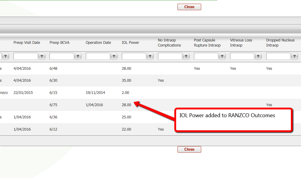
Raw data on cataract outcomes now includes IOL power and the Lines of Improvement outcome has been orientated the other way around so that a positive value means an improvement in visual outcome

Changes to complications graphs
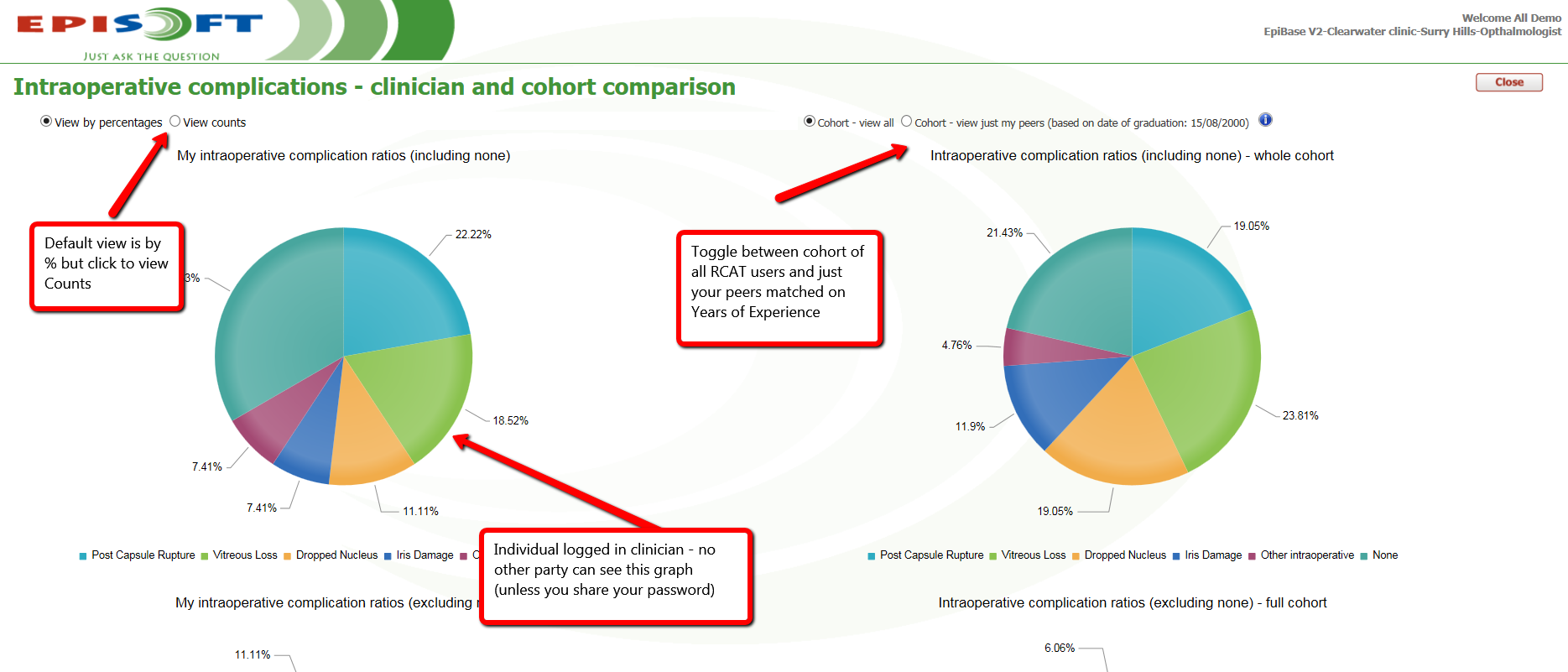
The complications pie charts are now defaulting to % view and you can choose the radio button "View Counts" to view the raw data counts.
The cohort charts on the right now have ability to toggle between data from the total group of RCAT users and a matched cohort of Doctors.

Changes to the Scatterplot graph of Refractive Outcomes
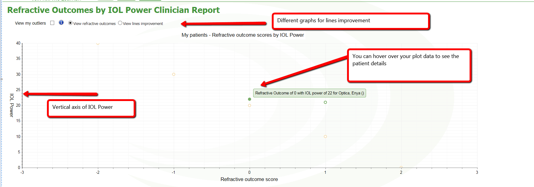
Changes to the Scatter series to view outcomes include change to vertical axis to view outcomes relative to IOL power and a toggle between refractive outcomes and lines improvement (so 2 x outcome measures plotted on the graph). You can also see your patient details by hovering over the data item on the plot.
The scatterplot is only YOUR data. If you are not the logged in clinician, this graph will be blank.
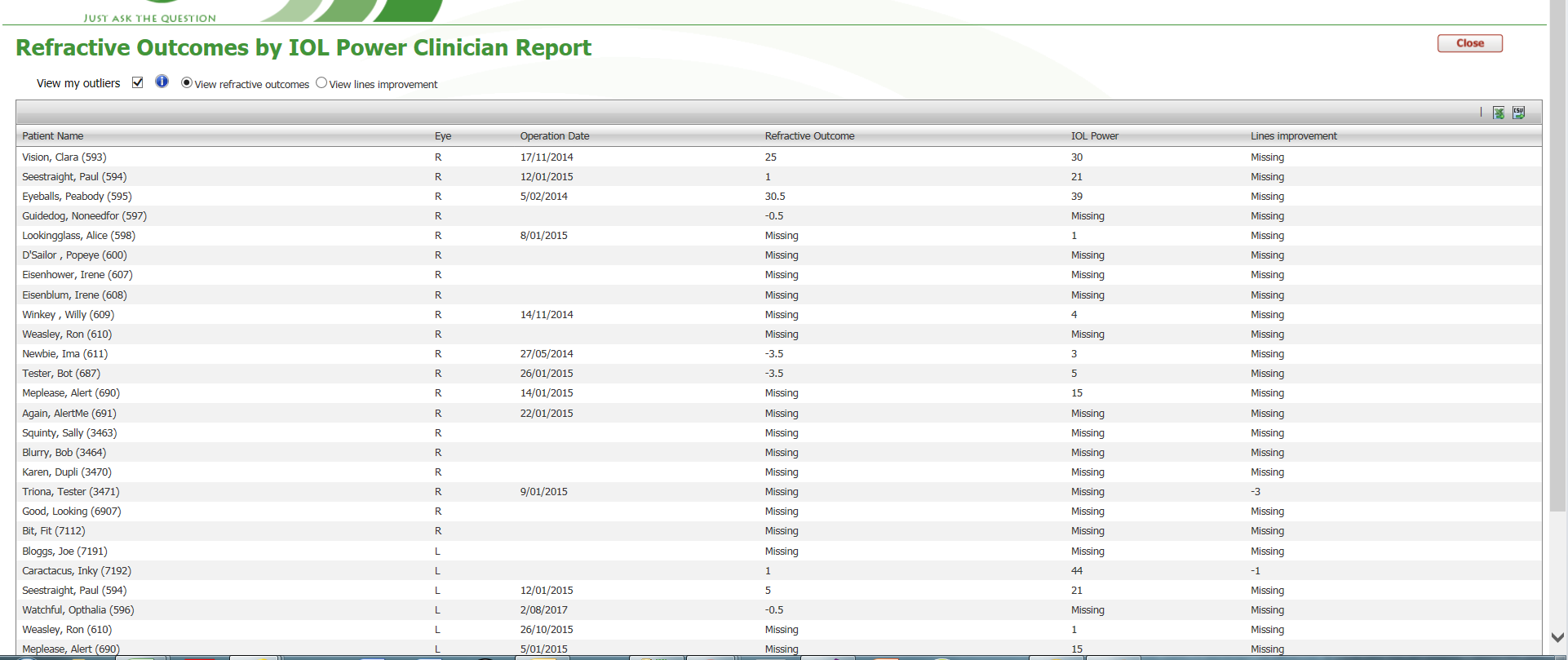
However, you can drill down to the outliers and this is at the practice level so you can fix the data within the practice.

Outliers checkbox shows the list of data issues below

New report - Refractive Outcome Summary Statistics
Shows the mean, the median, standard deviation from the mean, the count of records and the % of records in that grouping.
Broken up into 4 groups as shown below. The top grid shows the individual clinician's data and the bottom grid shows the RCAT cohort data

Raw data on cataract outcomes now includes IOL power and the Lines of Improvement outcome has been orientated the other way around so that a positive value means an improvement in visual outcome
Changes to complications graphs
The complications pie charts are now defaulting to % view and you can choose the radio button "View Counts" to view the raw data counts.
The cohort charts on the right now have ability to toggle between data from the total group of RCAT users and a matched cohort of Doctors.
Changes to the Scatterplot graph of Refractive Outcomes
Changes to the Scatter series to view outcomes include change to vertical axis to view outcomes relative to IOL power and a toggle between refractive outcomes and lines improvement (so 2 x outcome measures plotted on the graph). You can also see your patient details by hovering over the data item on the plot.
The scatterplot is only YOUR data. If you are not the logged in clinician, this graph will be blank.
However, you can drill down to the outliers and this is at the practice level so you can fix the data within the practice.
Outliers checkbox shows the list of data issues below
New report - Refractive Outcome Summary Statistics
Shows the mean, the median, standard deviation from the mean, the count of records and the % of records in that grouping.
Broken up into 4 groups as shown below. The top grid shows the individual clinician's data and the bottom grid shows the RCAT cohort data


